Roles: Visual Design, Illustration, Art Direction
Tools: Adobe Illustrator, Procreate
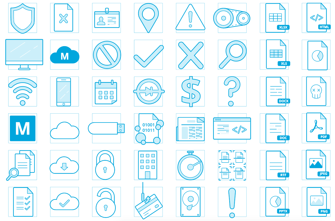
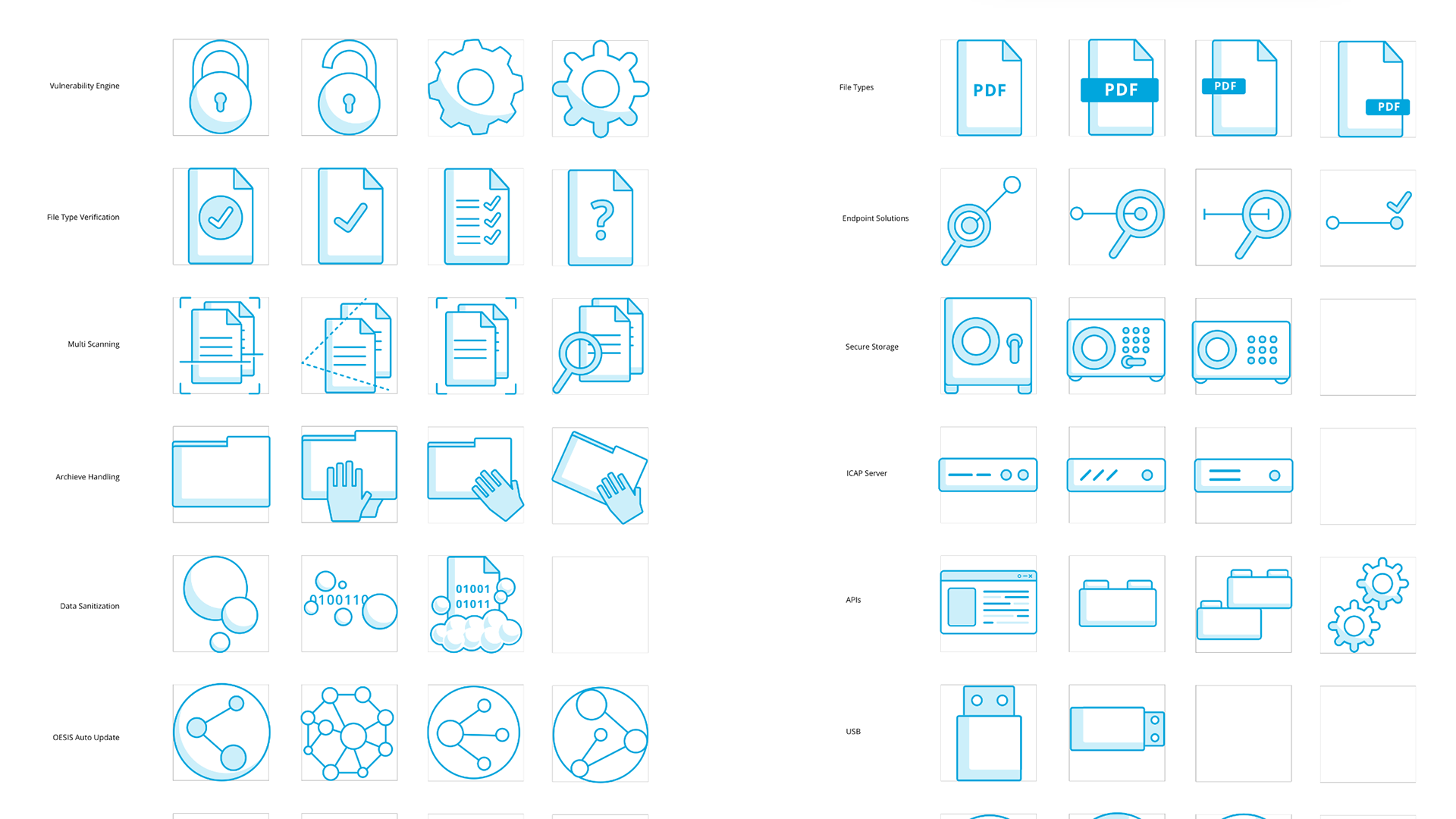
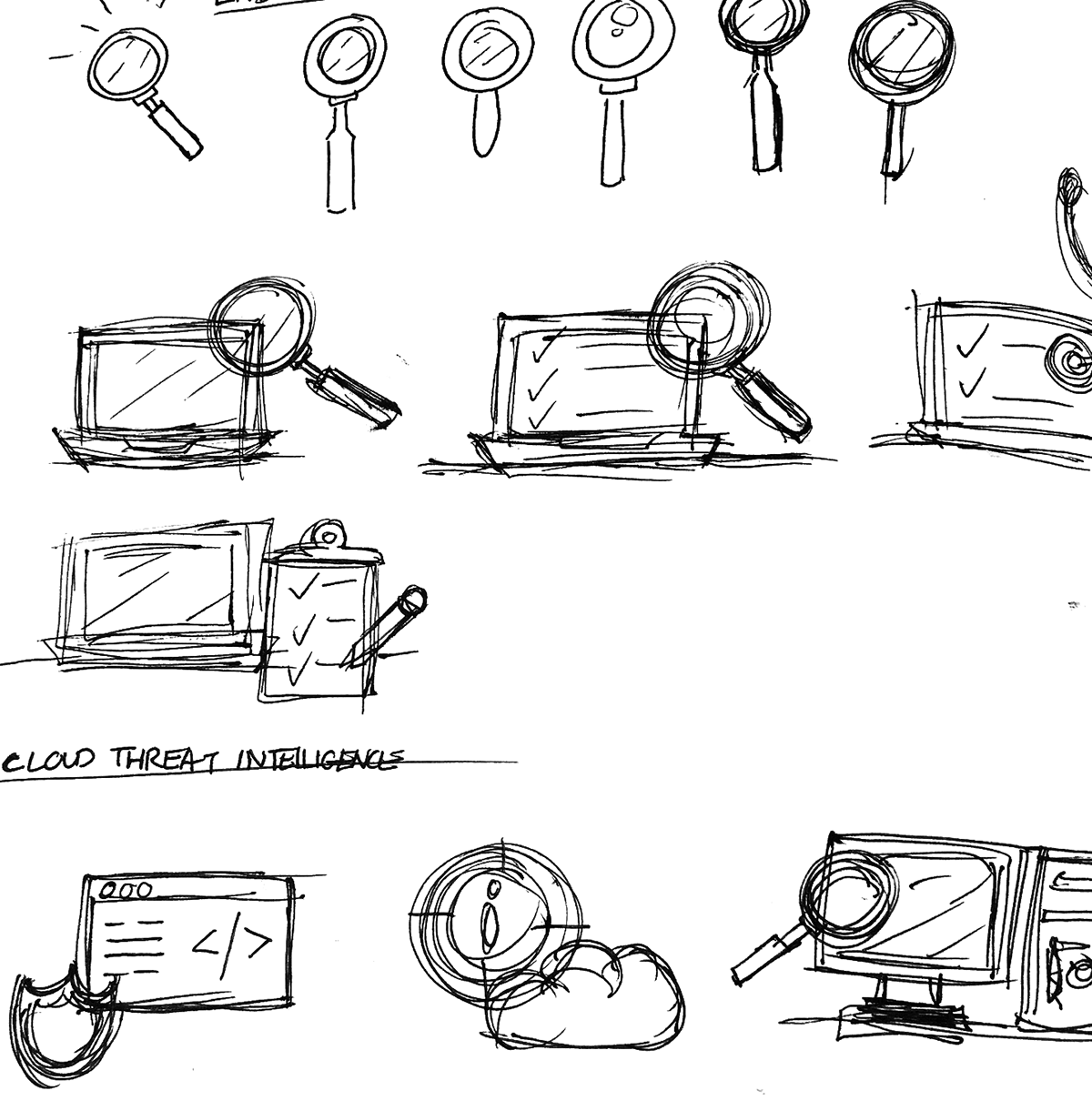
OPSWAT is a cyber security company that specializes in end-to-end encryption in B2B environments. They needed a series of icons to be used in their marketing materials, websites, and products. I created a set of icons that were simple, literal, and easy to comprehend. A lot of technology in the cyber security space is incredibly jargon heavy and can be difficult to follow. I took it upon myself to interview Project Managers to get insights into what product features they were aiming to highlight and how I could make them as digestible as possible. For each feature, I did multiple rounds of iterating. I researched what competitors were doing, tested various shape combinations, and tested the way the icons were reading at different scales to determine which version would be the most appropriate for the feature it represented. Creating symbols that could both stand on their own without context and also within the product UI were both top of mind as I went through the design process. It was an excellent exercise in consistency, iteration, scalability, and representation.
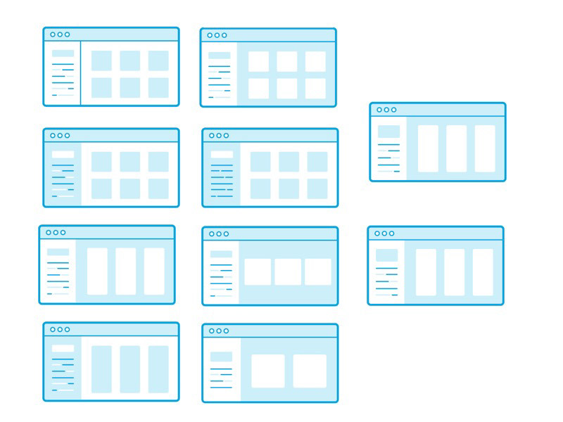
The process of testing icons against each other
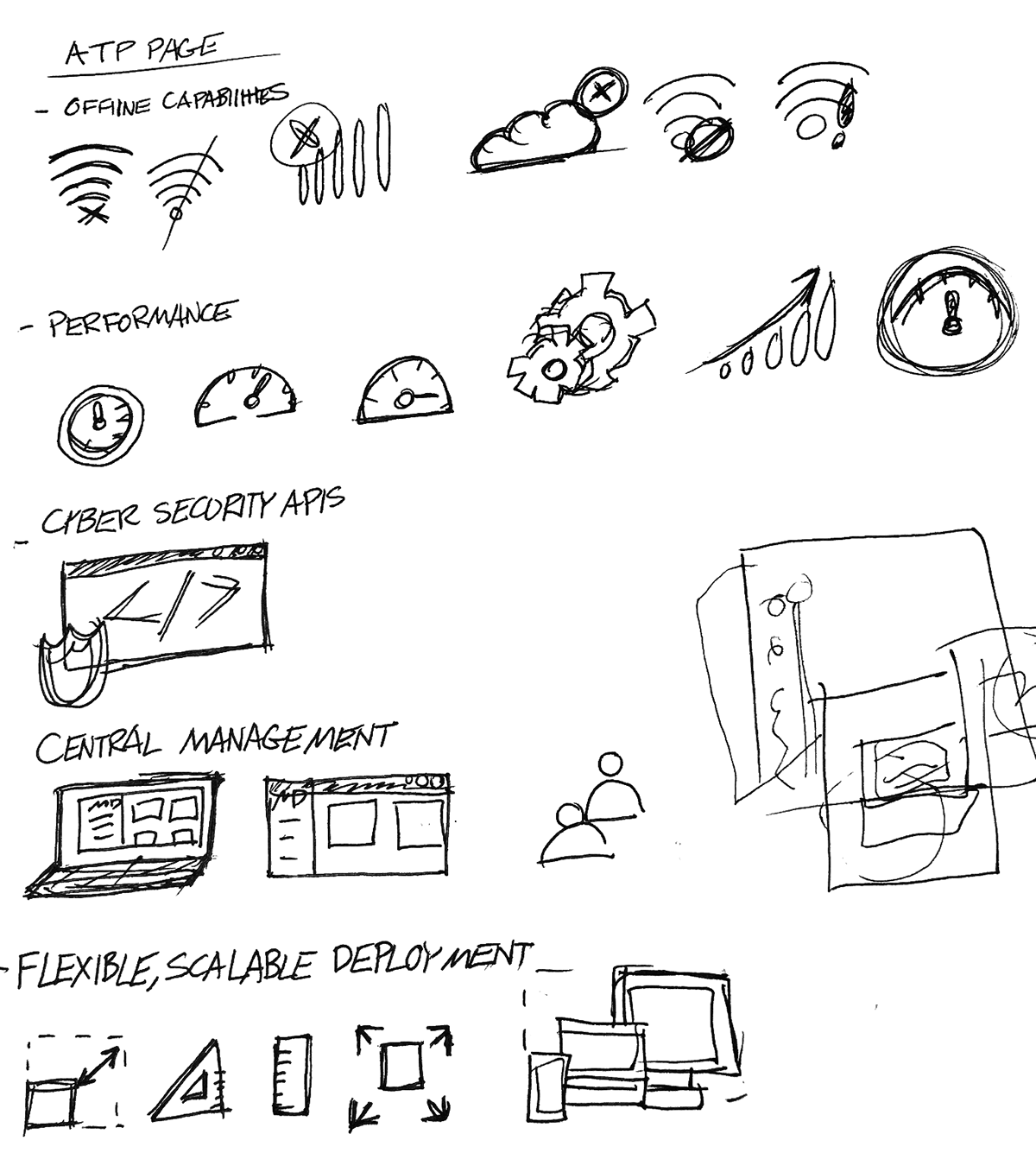
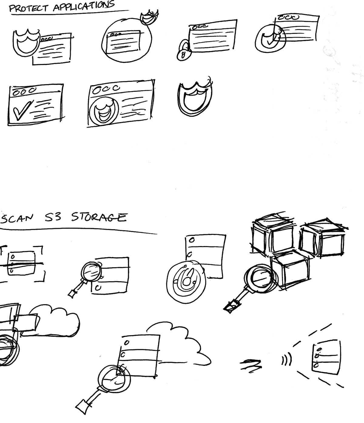
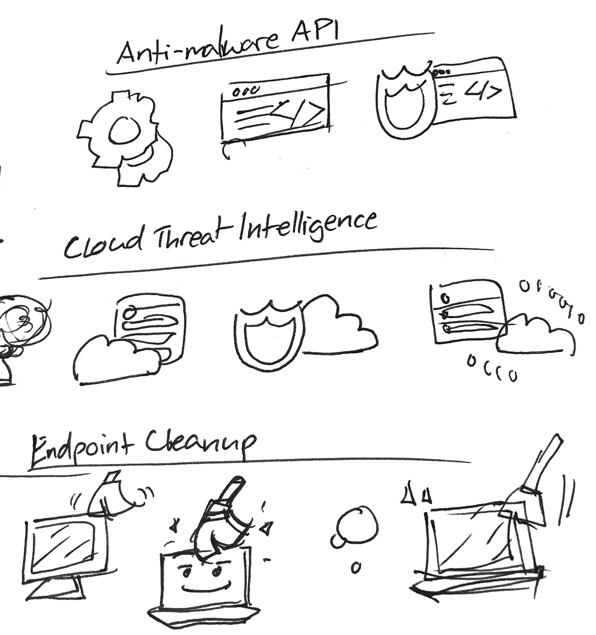
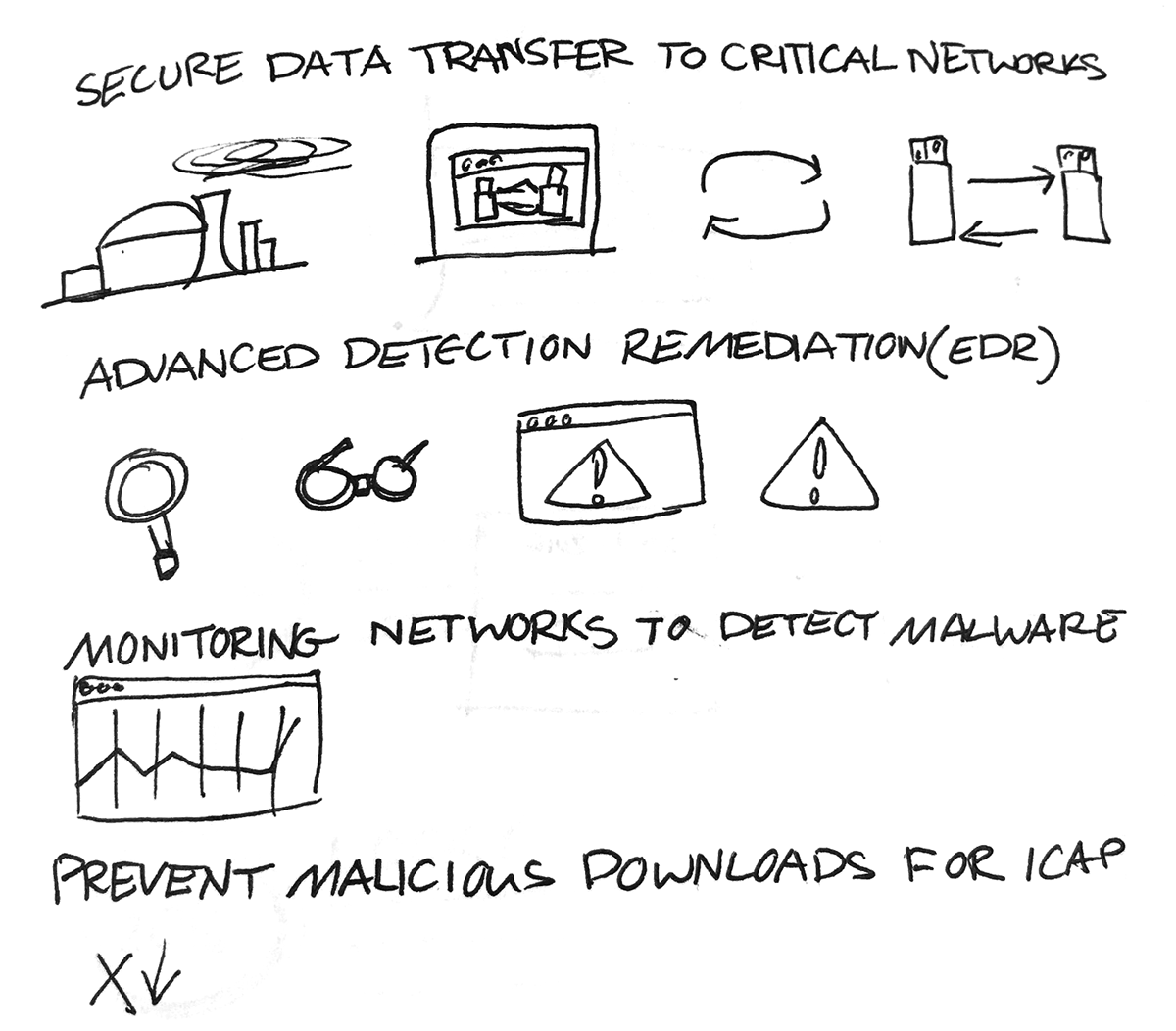
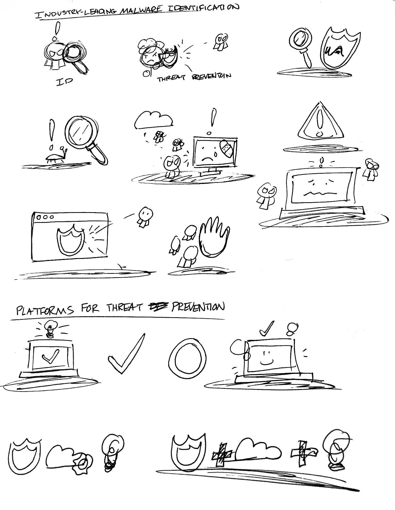
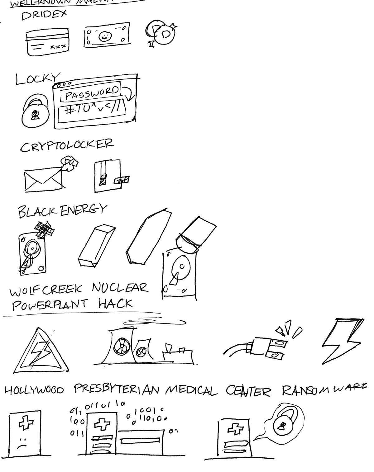
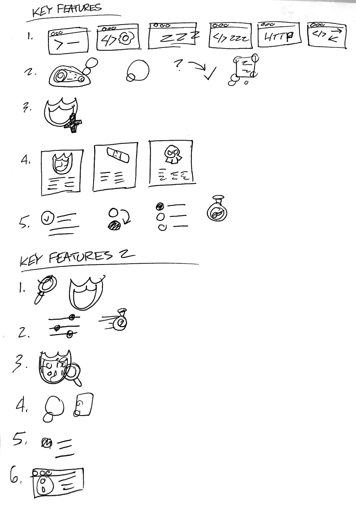
Traditional sketches of the process
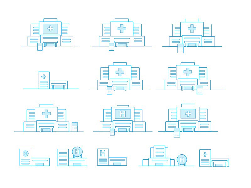
Iterations of hospitals
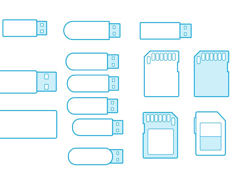


More iterations of concepts and objects